Purple Room | 1 Week Budget-Friendly Small Room Makeover!
Before & After, Room Makeovers
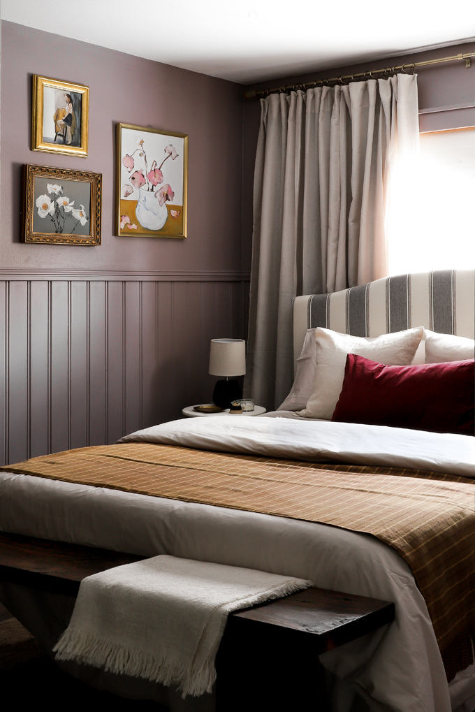
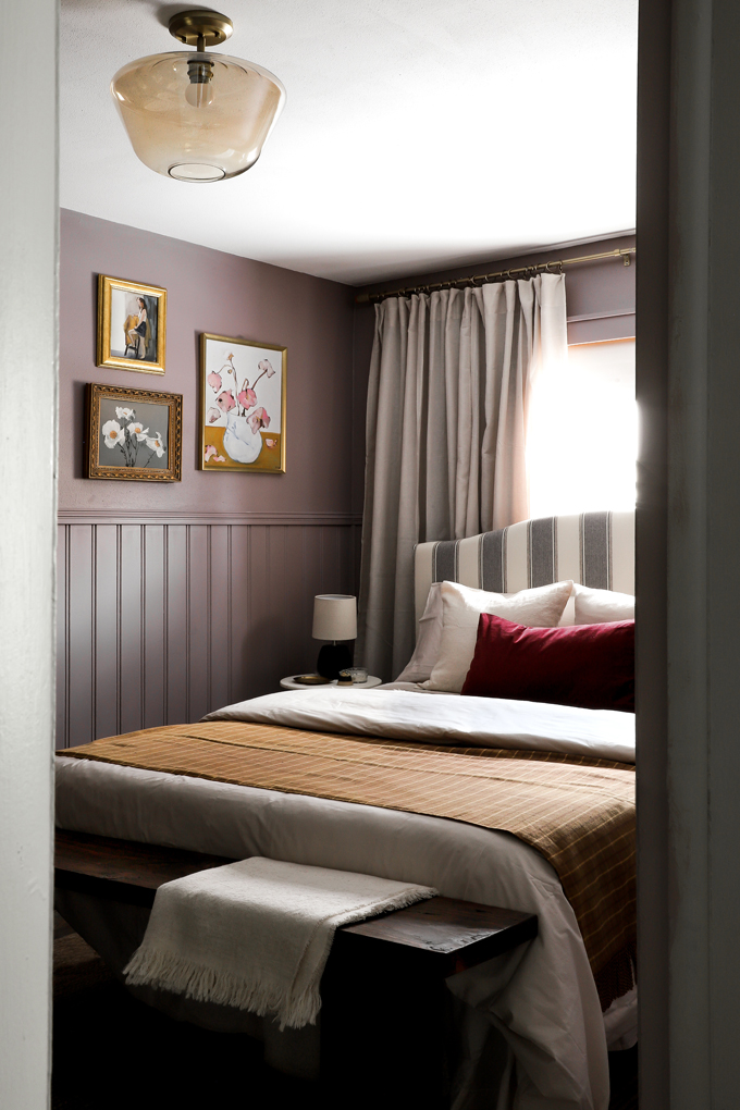
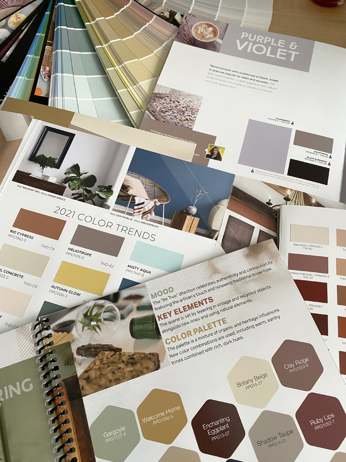
First room reveal of 2021! The paint color is HELIOTROPE!! Who guessed it?!? For those just tuning in, a week ago I sampled 3 colors from our partner PPG’s Timeless Paint 2021 trend books. After picking this beautiful, muted purple, Mr. Yolo and I transformed a blank room in our bungalow rental into a cozy getaway for guests in a week! I kept the color hidden on IG stories (you can catch up with the process in the PURPLE ROOM highlight) and today is the big reveal! It’s purple! I know I have said it before, but purple is SO out of my comfort zone. But now I have an Eggplant bathroom and a Heliotrope bedroom. So maybe I am a purple person, ha! I am going to get into the color selection process, working with a small room (this one is 8×14) and my budget-friendly bedroom shopping list. But first, some before and afters!


The Room
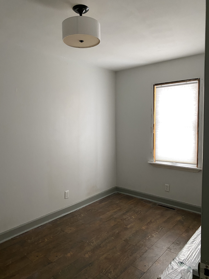
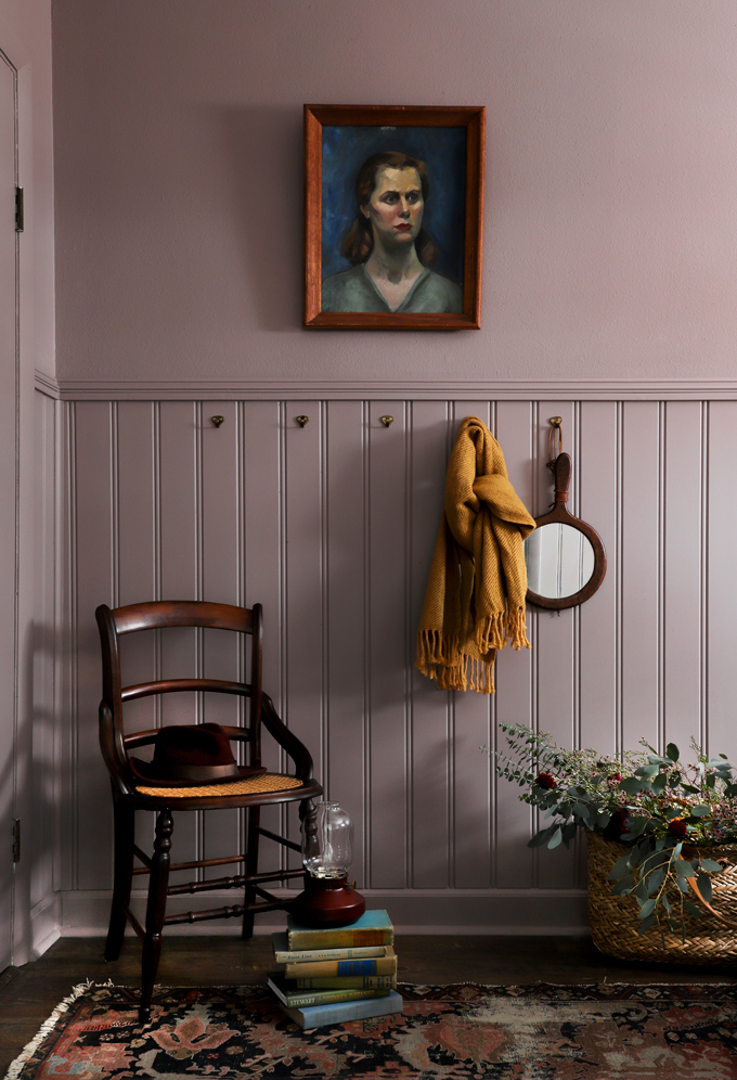
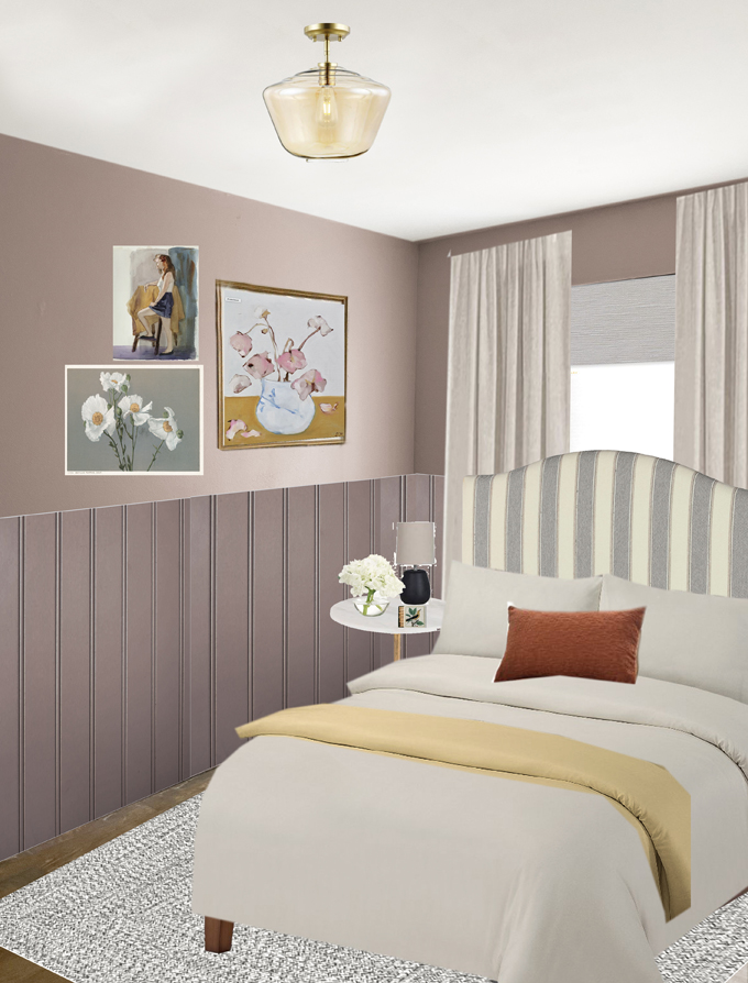
This room at our Bungalow short-term rental is pretty small, 8×14, and has some layout challenges because it’s long and narrow. When Mr Yolo lived here, he had bunk beds on the long wall for guests (mostly his young nephews), but adult guests are typically not fans of bunk beds. Plus, changing sheets on the top bunk is a pain! I played around with the idea of a daybed on the long wall, or a pullout trundle…but neither are convenient for guests, and do not utilize the space well. Once I got the idea to move the bed in front of the window, the layout fell into place! We opted for a full bed so guests could walk on both sides. Next, it was time to design the room.


Paint Color
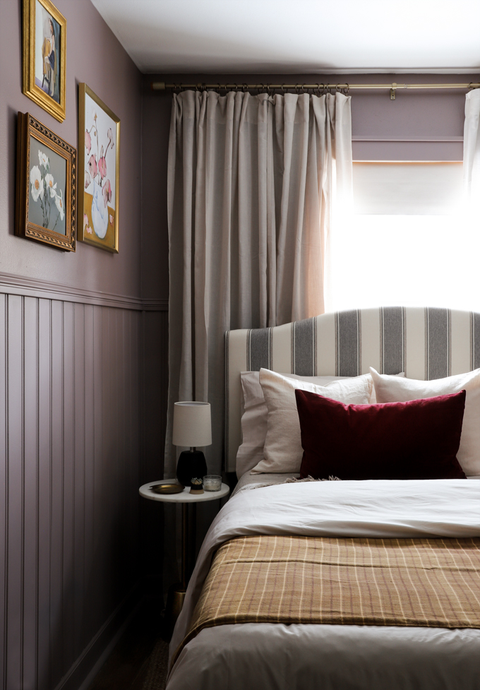
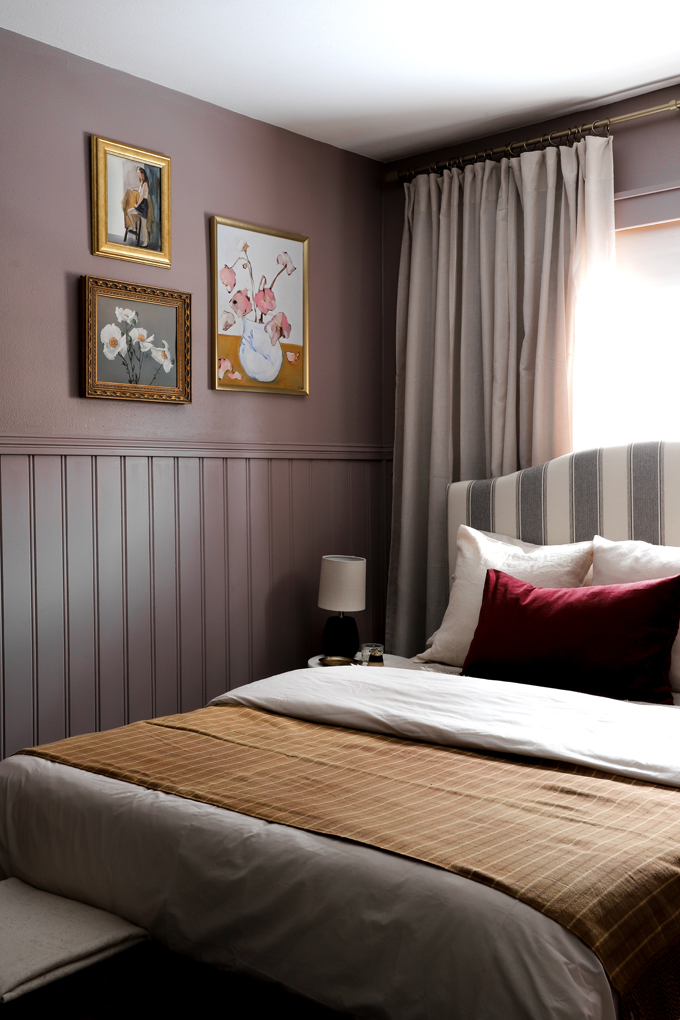
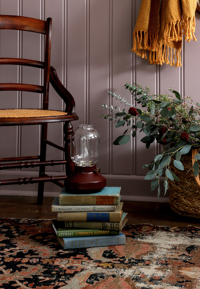
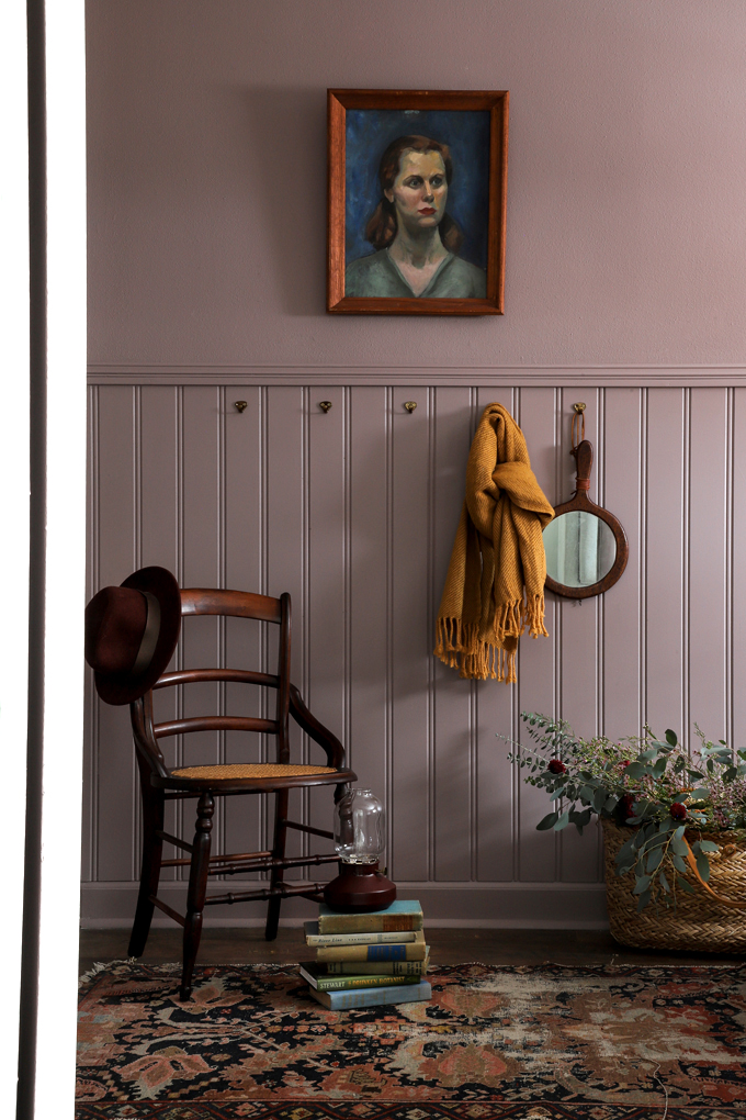
We partnered with PPG Timeless Paint on this room makeover. I wanted a color that was bold, exciting, and on trend for 2021. I looked through their trend books and I kept stopping at their Heliotrope #PPG1015-5 color. It was so interesting! It’s a muted purple, but still rich, and not overpowering. I was not exactly sure how I would design a room with this color, but I knew I had to sample it! I swatched Heliotrope #PPG1015-5, Clay Ridge #PPG1051-6 and Chalky Blue #PPG1153-5 (Mr. Yolo’s pick) in the bedroom and Heliotrope was a clear winner! Even prettier in person.
Pause, for my usual disclaimer: ALWAYS swatch a paint color before painting! The lighting in the room will affect how the color looks in your space, this color reads more warmer/cooler, muted/saturated throughout the day and as I decorated. So swatch on multiple walls, and look at it during different times of the day.
Paint Finish
I knew this color would read beautifully in a flat sheen, but was hesitant because we have found flat finishes harder to clean. I did a little research on PPG’s paint and their formula is tested to be durable, wear resistant, and easy to wash. I’m Sold!
Added bonus: the paint is one coat coverage! We typically roll-on paint, then edge, then roll on one more coat. But after the first coat, it looked so good that we edged, did a couple touch-ups and were done. The finish was super smooth, and even! Tip: If you are not a fan of texture, like me, use a flat finish to help downplay the texture. Glossier paint makes texture stand out.
The Design Process
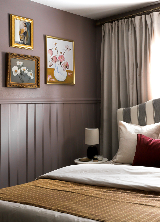
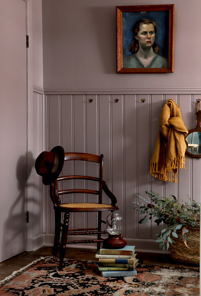
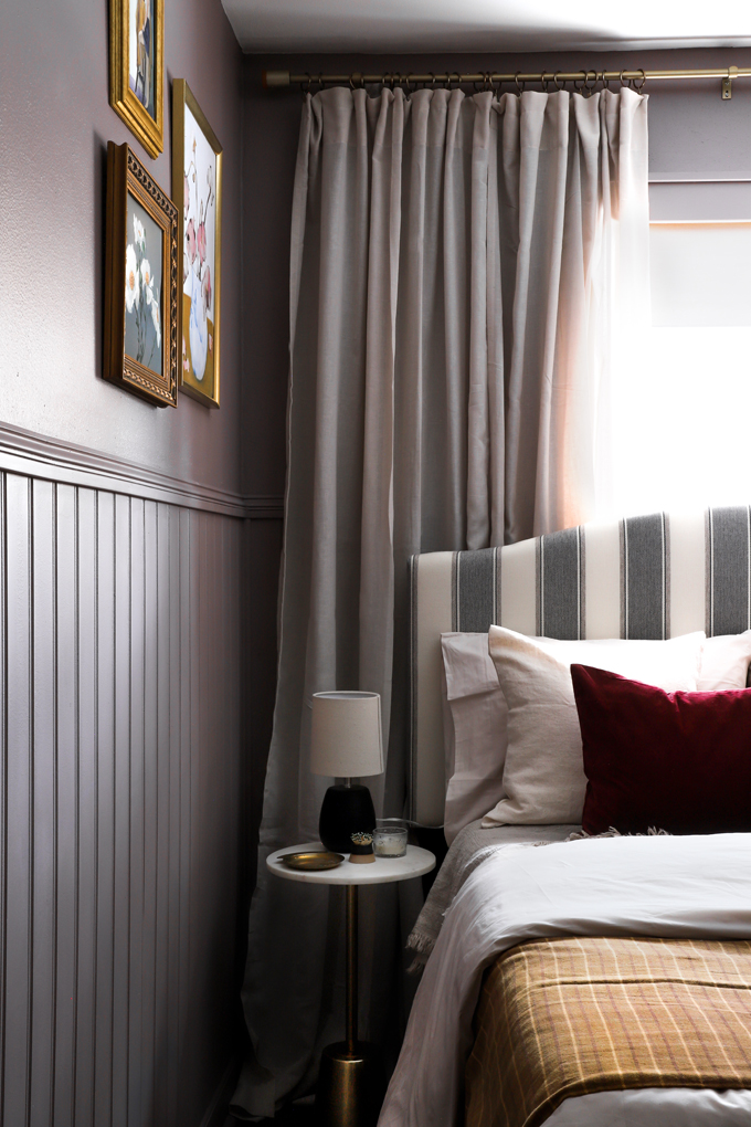
I had so much fun challenging myself with a new color! I knew I wanted to paint the whole room. It’s bold, but that is what I was going for. Even though the room is small, I wanted to add some visual interest to the walls, so we paneled 4ft up from the baseboard and added a chair rail. Such a great way to break up a long wall, and give a defined space for art. Speaking of art, I went back and forth on the art so many times! I did not want the room to look too feminine, too farmhouse, or too childish, which it definitely started skewing with different art combinations. My idea to introduce some more color, mustard and deep red, to play off the purple seemed a little crazy, but the art tied it all together. And I think the combination feels so lush.
Mockup
When we are doing a quick room makeover like this, the more prepared I am going into it, the better! I like to take a photo of the empty room, and then Photoshop all the decor items onto the photo. I have all the steps saved in my “PHOTOSHOP” highlight on Instagram.
Art Tips:
– For the trio of art, I used digital download from Juniper Print shop that I got printed at UPS on Matte Photo paper (Alice & Ranunculus)
– I downloaded the poppy art for free from the New York Library Archives.
– Frame without the glass so it looks more like a painting.
– Use thrifted gold frames. I get mine at Goodwill for $1 – $5.
– Digital downloads are great for short-term rentals so you don’t have to worry about your original art getting ruined.
– Pick art that ties together the colors in the room.
– If a painting sparks joy, hang it! Art should make you happy! I thought the colors in the vintage portrait were so beautiful against the purple. Glad she found a home in the room 🙂
Shopping
I wanted this room to be budget friendly! Things can get broken at a short-term rental so it’s good to put items in the room that are easy to replace! I ordered most items online, then, as always, sprinkled in some vintage items. Once the room was 90% done, I did a shopping day to get the finishing touches!
Shopping Links!
Paint Color #PPG1015-5 Heliotrope Flat Interior One-Coat Paint with Primer
Primed Bead Paneling
Striped Headboard
Marble Side Table
Bedframe
Casper Sheets
Casper Original Mattress
Duvet insert
Dark Red Pillows
Side Lamp
Dark Red Lantern
Curtain Rod
Linen Curtains
Mustard Scarf/Throw
Vintage:
Bench
Frames
Chair
Rug
Blanket
This post was created in partnership with PPG Paint, thank you for supporting my amazing sponsors!
EXPLORE MORE: Before & After, Room Makeovers